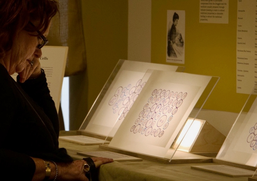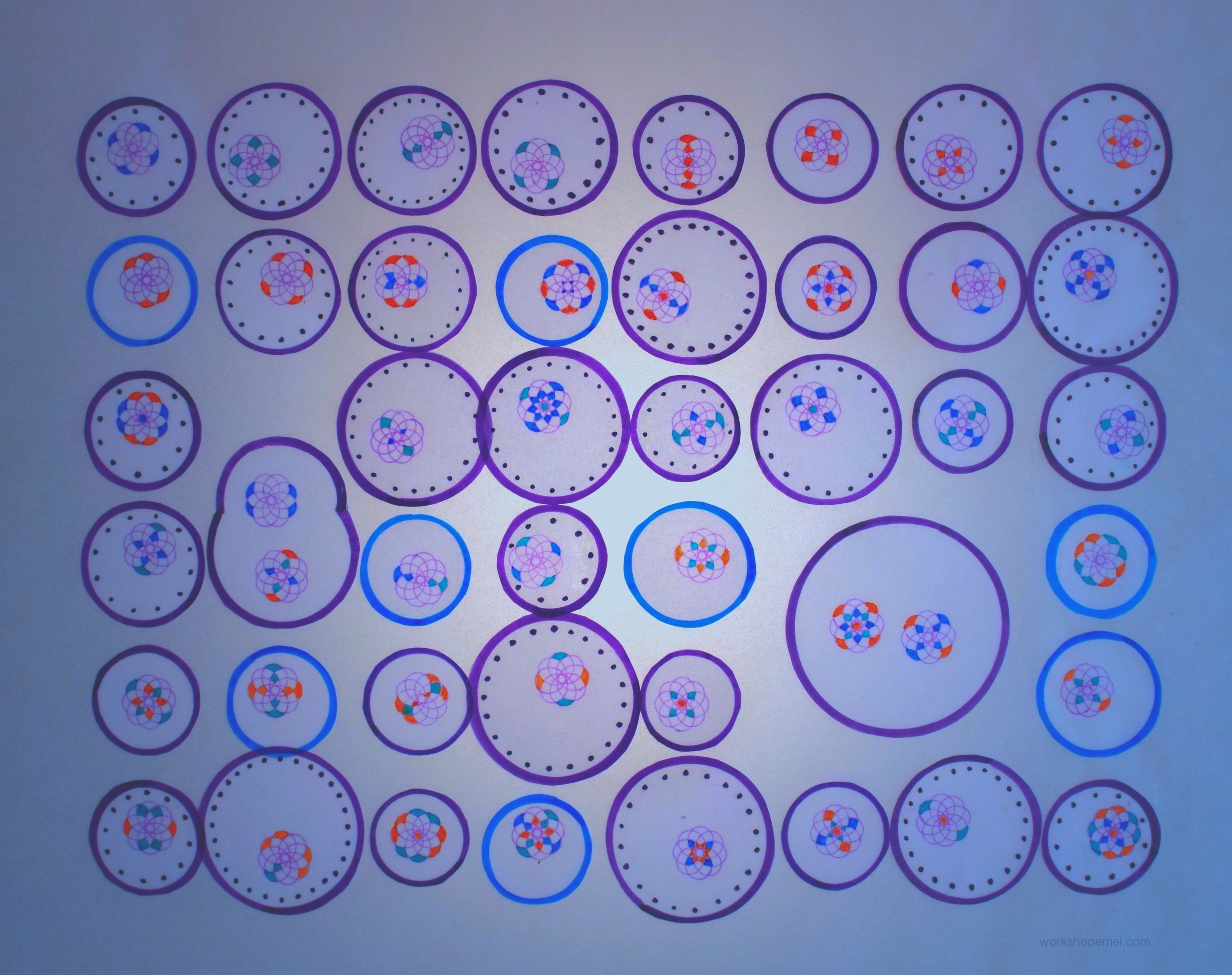
There is quite a bit of text for this exhibit. It is designed so that different narratives can be written for specific audiences.


dot corrected

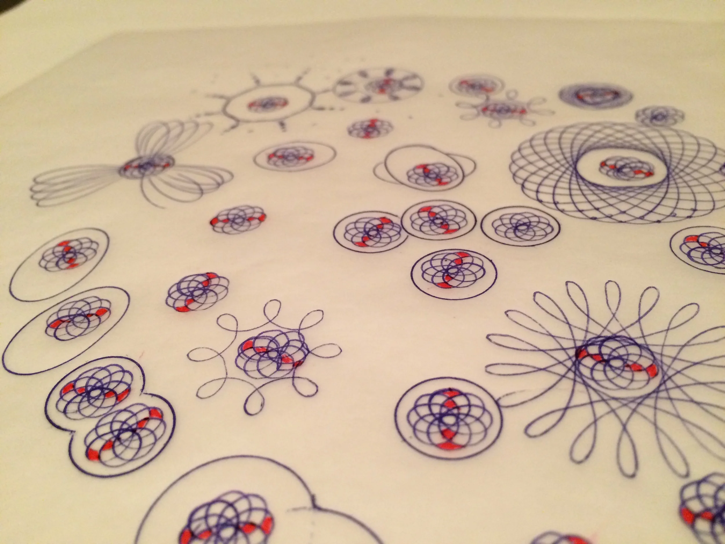
First concept test.

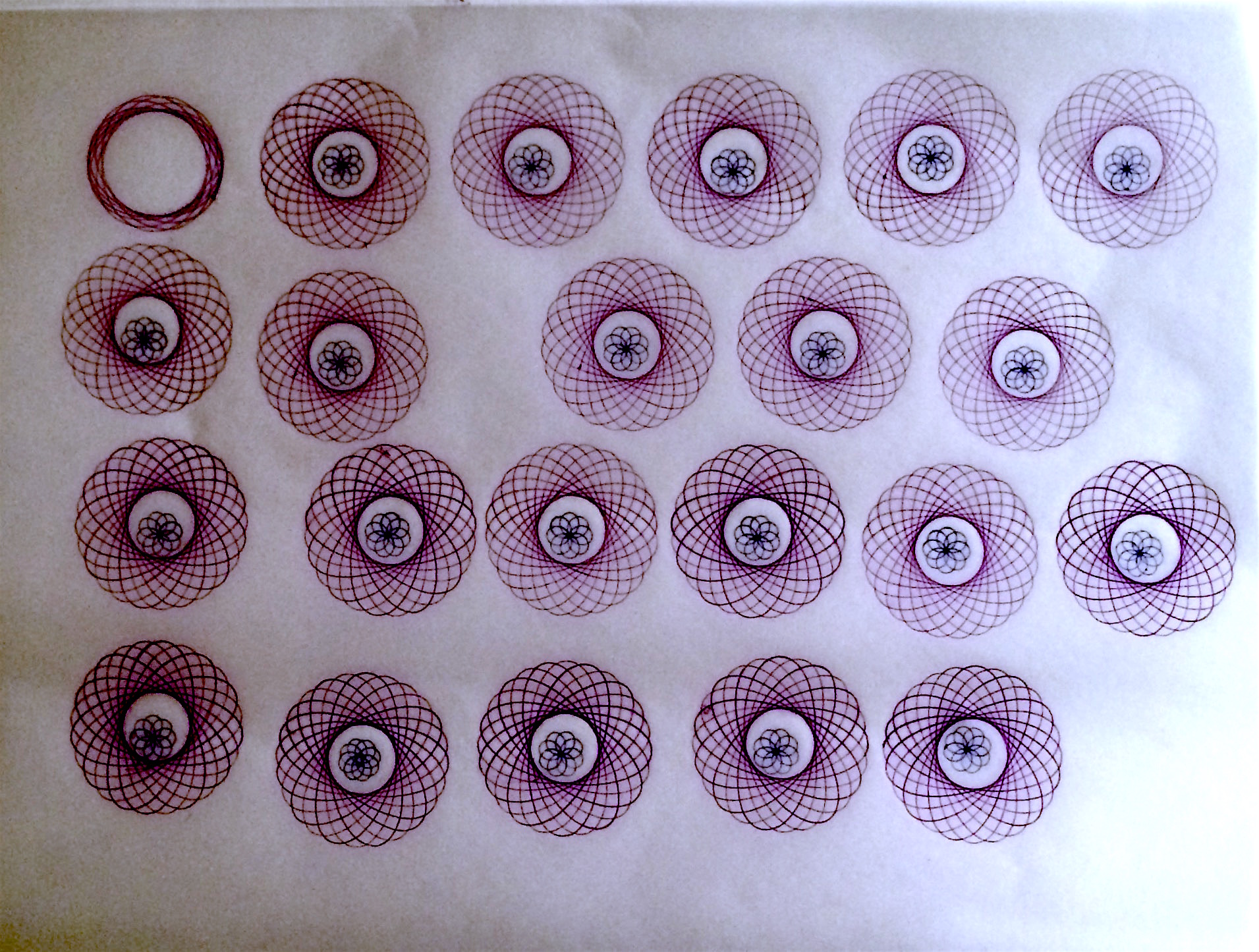
The original tests used a hypotrochoid design. It soon became clear that this design was not going to work. These circles started to look like eyeballs and were following me.


Concept test using a multiple layers of acrylic plates. Although it was visually more striking, I didn't feel it worked for this exhibit because cells on a slide would ideally be single layered.

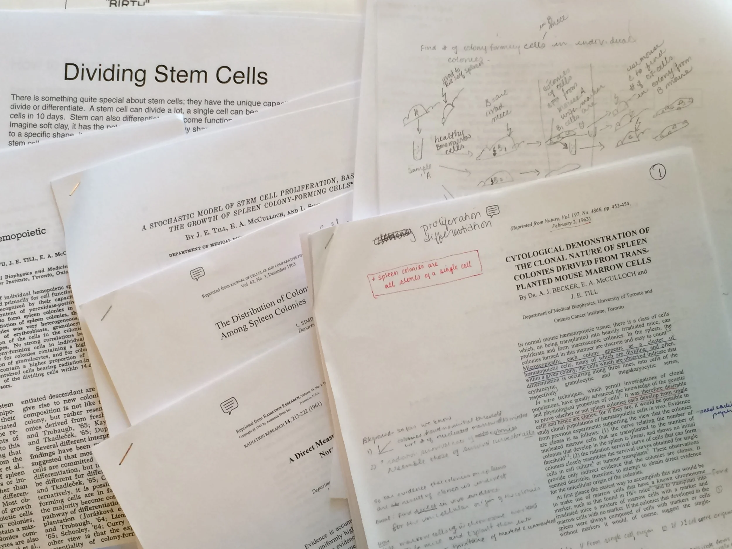
My collection of early research papers by Till and McCulloch. In this pile is a paper about the stochastic model of stem cell proliferation that resulted in a last minute second exhibit for the Protean Self exhibit.

Early proof of concept work with the cardboard and tape holding things together. Thanks to Peter Ma for his lighting expertise. I ended up using LED outdoor garden lights from Canadian Tire and modifying them.

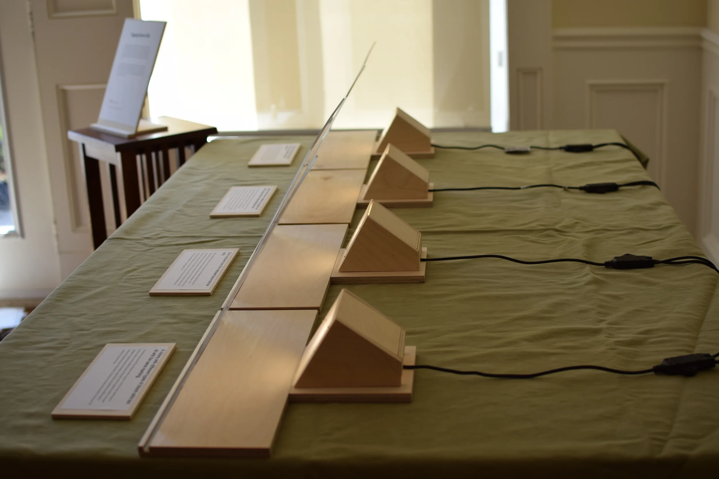
The installation from behind.

Light box and stand built in my woodwork shop. Russian birch plywood and plexiglass is used for the light box.

Test run of the exhibit in my kitchen. Several arrangements were tried before I got something that looked pleasing from all angles.

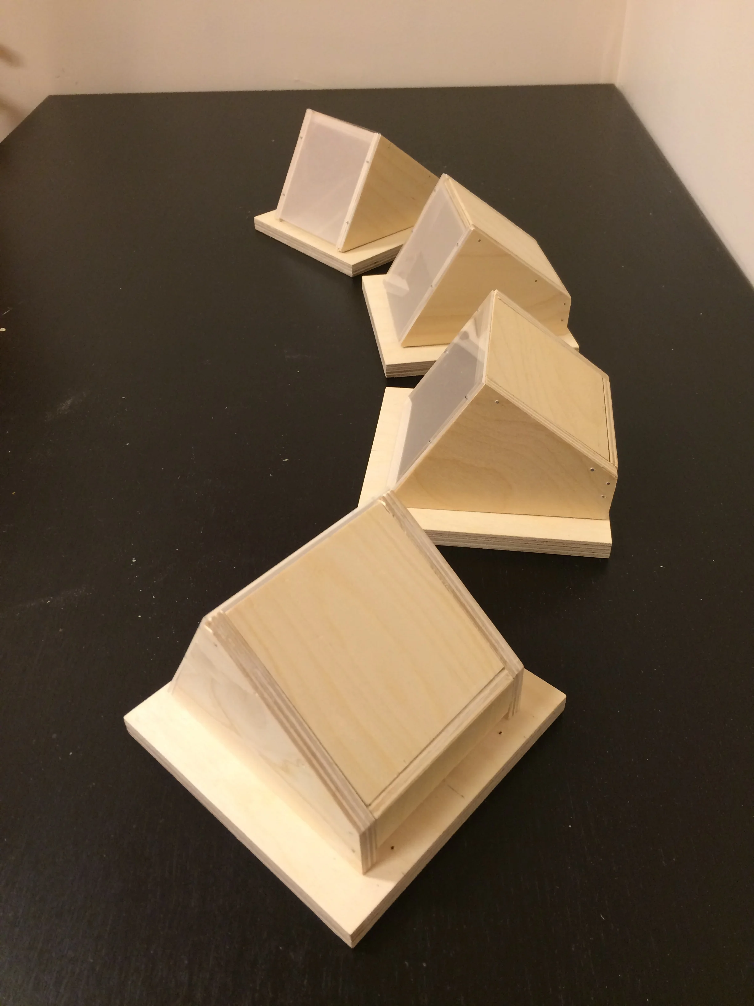
I designed these little LED light boxes and made them in my workshop. I always look forward to including some woodwork into the science art. Acrylic sheets and plywood.

Different versions of the exhibit were reviewed by several people, including Dr. Till. I have used this image on Twitter because one has about 2-3 seconds to grab the reader's attention.
Tagging Stem Cells: Science / Art / Gallery Exhibit / Online Exhibit

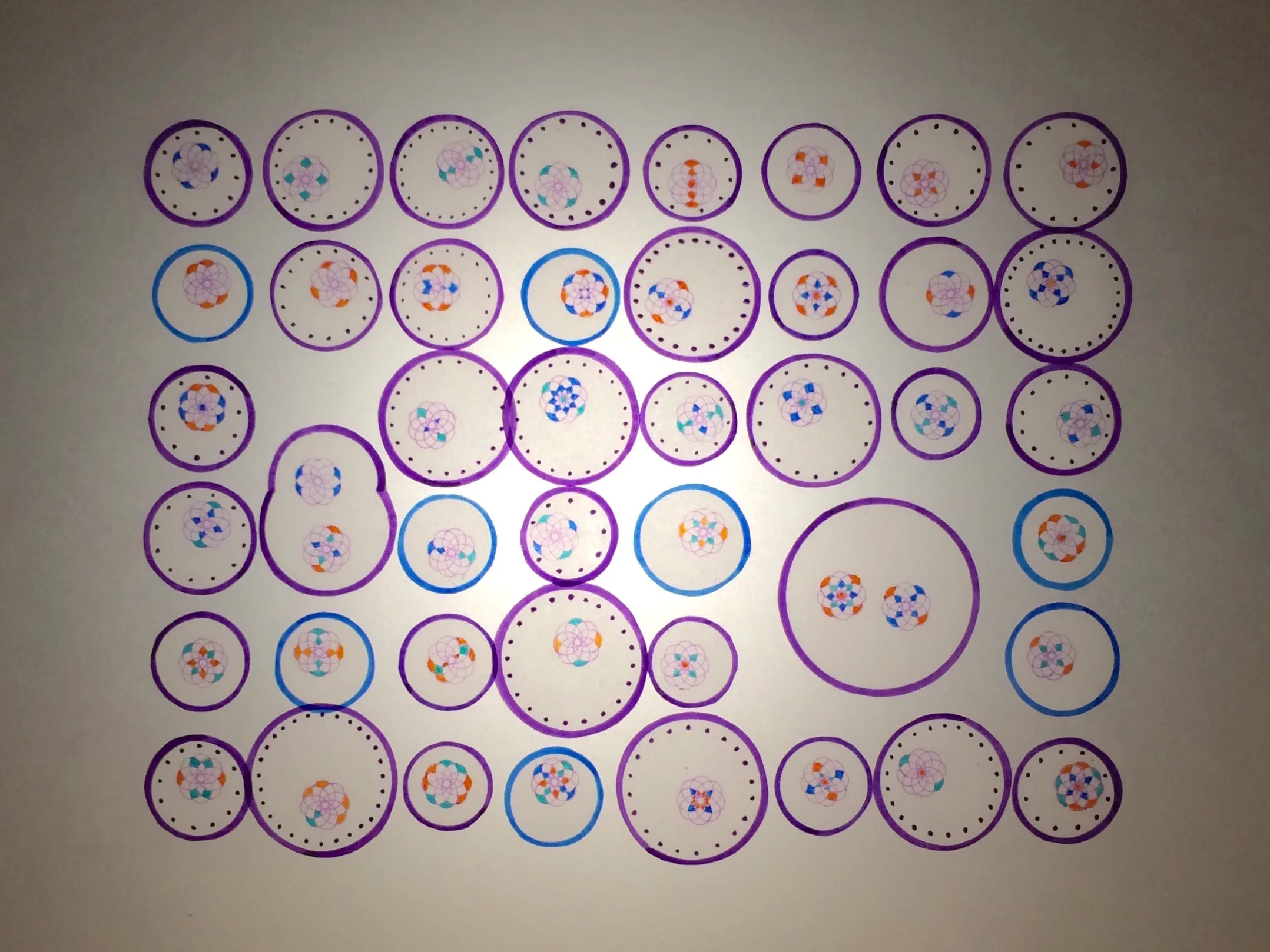
First set of cells. Marker pen on tracing paper. It soon became clear that this design was not going to work. These circles started to look like eyeballs and were following me.


Version 2


Version 2


